

Thursday, May 19, 2016
ALBUM ART CRUSH | Deerhunter, "Microcastle / Weird Era Cont."
"Microcastle / Weird Era Cont." is a double-album by American indie-rock band Deerhunter. Released in 2008, this album is the critically-acclaimed follow-up to their debut, "Cryptograms".

Tuesday, May 03, 2016
MUSIC | on rotation: Jan - Apr 2016
I've added a little segment where I make a small list of albums and songs that I've been having on heavy rotation from January till the present! It seems to me that these few months are those periods where you get fewer releases as compared to the months after May - probably artists are waiting for the summer tour to release their material - but nonetheless, after a little digging and sifting through the albums released in the beginning of the year, I'm pretty happy with what I've found so far.

Monday, April 18, 2016
ALBUM ART CRUSH | Purity Ring, "Shrines"
"Shrines" is a release in 2012 by the electronic duo Purity Ring. For the cover and gatefold design, the band enlisted the help of their Canadian compatriot - artist and illustrator Tallulah Fontaine.


The lungs overhead was a direct prompt from one of the album's songs, "Fireshrine"
image credit: LPWTF
Wednesday, March 30, 2016
ART & DESIGN | punk pioneer: Jamie Reid
Jamie Reid was born in Croydon, United Kingdom in 1947 to a politically-active family. His father was an editor at the Daily Sketch, a tabloid newspaper, and his grandfather was the head of the Druid Order and had stood for parliament just before the first World War.
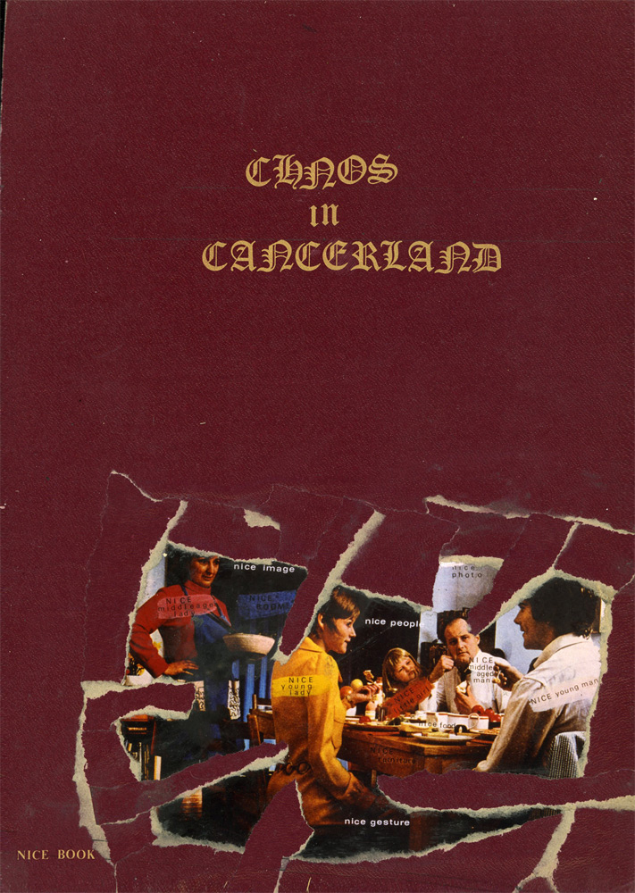
Reid identifies himself as an anarchist and is influenced by the Situationist movement, an anti-capitalist movement in art and politics. He found that it was difficult to understand the lengthy statements of the Situations, and aimed to "simplify and visualise" their jargon.

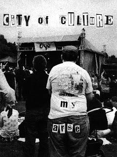
Reid identifies himself as an anarchist and is influenced by the Situationist movement, an anti-capitalist movement in art and politics. He found that it was difficult to understand the lengthy statements of the Situations, and aimed to "simplify and visualise" their jargon.

Sunday, February 21, 2016
ART & DESIGN | uncanny ambiguity: Toilet Paper Magazine
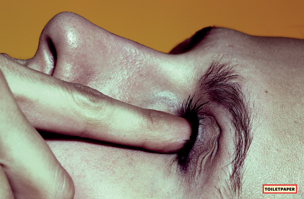
Toilet Paper Magazine is a bi-annual, photo-based publication by Marizio Cattelan, an artist, and Pierpaolo Ferrari, a photographer. They collaborated on a photoshoot for W Magazine in 2009 and worked on a new publication for themselves, inwhich Toilet Paper Magazine was born in 2010.



Sunday, January 17, 2016
ART & DESIGN | shading optional: Ellsworth Kelly
Without an education in Art History, I find discovering artists difficult with no starting point to delve into. There are art movements to explore, but within a certain art movement there is a plethora of artists. So many artists, so little time...anyway for my first artist post I'm talking about someone I had discovered just late last year: Ellsworth Kelly
Hailing from New York, Ellsworth Kelly is a painter, sculptor and printmaker. His style is often hard-edge, colour-field, or minimalism painting.


Hailing from New York, Ellsworth Kelly is a painter, sculptor and printmaker. His style is often hard-edge, colour-field, or minimalism painting.

Colors for a large wall, 1951
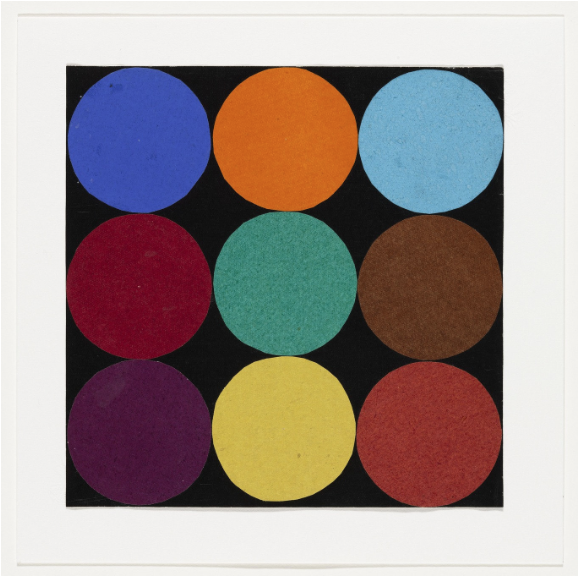
Nine colors, 1951
Friday, January 08, 2016
ALBUM ART CRUSH | Björk, "Voltaïc"

In my first post of 2016, I hope to dedicate a segment to a that holds alot of inspiration for me: album art!
Kicking off the first album art crush is Björk's 2009 release, Voltaïc. It's a limited edition LP/CD/DVD boxset comprising of related material from her studio album, Volta. I'm not the biggest fan of Björk, but I always enjoy the unconventional approach of the designs of her album releases.
Subscribe to:
Posts (Atom)